About Syncfusion® .NET MAUI Sunburst Chart Control
The Syncfusion® .NET MAUI Sunburst Chart (SfSunburstChart) is used to visualize hierarchical data structures. The chart organizes data in multiple levels, where each level represents a different category or subcategory. This visualization helps users understand relationships and dependencies within the data in an intuitive and user-friendly way.
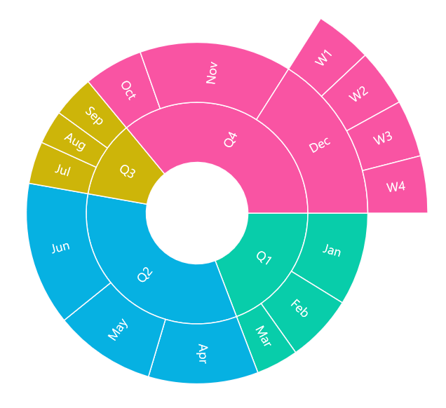
Business use cases
- Business intelligence applications that require visualizing hierarchical data such as organizational structures or product categories.
- Financial and analytics dashboards that display multi-level data distribution and contribution analysis.
- Data-driven applications that require comparative insights across parent and child categories.
- Scientific and research applications that visualize nested and hierarchical relationships in datasets.
Key features
- Hierarchical data visualization allows representing multiple levels of categories and subcategories effectively.
- Data label allows displaying labels for better readability of each segment.
- Legend allows identifying categories and understanding data representation clearly.
- Tooltip allows displaying additional information on interaction with segments.
- Appearance customization allows applying custom color palettes and styling to enhance visualization.
- Center view allows displaying additional information or summary content at the center of the chart.
- Drill‑down provides the ability to navigate into deeper levels of the chart, making it easier to view detailed data within large hierarchies.
- Selection allows specific segments to be highlighted, giving clear focus on chosen parts of the chart.
Globalization
The following table summarizes the globalization support available in this control.
 Full Support
 Partial Support
 Not Applicable
 No Support
| Control | Localization | RTL | Time zone | Screen reader | Keyboard navigation |
|---|---|---|---|---|---|
| Sunburst Chart | |
|
|
|
|
Related controls
- Circular Charts for representing proportional data using pie and doughnut charts.
- Cartesian Charts for visualizing tabular data trends and comparisons.
See Also
- Getting Started shows a step‑by‑step guide to begin using the Sunburst Chart control.
- Appearance explains how to customize chart appearance and styling.
- Labels helps configure data labels and segment display.
- UI Kit provides interactive demos and ready‑made UI examples.
Resources
Feature Tour
Get a quick overview of key features and capabilities to kick start your journey.
Explore Features
Tutorial Videos
Watch step‑by‑step video guides to quickly understand concepts and implementation.
Watch now
Knowledge Base
Find practical solutions, troubleshooting tips and how‑to guides for common scenarios.
Search KB's