Customize Data Points in .NET MAUI Spark Charts
Prerequisite: Ensure that the required NuGet package is installed, the necessary namespaces are imported, and the Spark Charts control is properly configured in your application. For detailed setup and configuration instructions, refer to the Getting Started guide.
Customizing data point colors improves visual clarity by distinguishing key values. This enables efficient interpretation of chart data and helps identify critical trends at a glance.
Data point styling
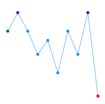
The color of the first, last, high, low, and negative data points can be customized using the following Brush type properties. For line and area charts, these fills render visibly only when the ShowMarkers property is enabled.
- FirstPointFill - Used to highlight the first point.
- LastPointFill - Used to highlight the last point.
- HighPointFill - Used to highlight the highest point.
- LowPointFill - Used to highlight the lowest point.
- NegativePointsFill - Used to highlight the negative points.
The following code snippet demonstrates how to customize the data points in a spark line chart.
<sparkchart:SfSparkLineChart ItemsSource="{Binding Data}"
                    YBindingPath="Value"
                    FirstPointFill="Green"
                    LastPointFill="Blue"
                    HighPointFill="Purple"
                    LowPointFill="Red"
                    ShowMarkers="True">
    <!-- code omitted for brevity -->
</sparkchart:SfSparkLineChart>
SfSparkLineChart sparkchart = new SfSparkLineChart()
{
ItemsSource = new SparkChartViewModel().Data,
YBindingPath = "Value",
FirstPointFill = new SolidColorBrush(Colors.Green),
LastPointFill = new SolidColorBrush(Colors.Blue),
HighPointFill = new SolidColorBrush(Colors.Purple),
LowPointFill = new SolidColorBrush(Colors.Red),
ShowMarkers = true
};
//code omitted for brevity
this.Content = sparkchart;NegativePointsFill is applicable only to SfSparkColumnChart and SfSparkWinLossChart.
The following code snippet demonstrates how to customize the segments in a spark column chart.
<sparkchart:SfSparkColumnChart ItemsSource="{Binding Data}"
                    YBindingPath="Value"
                    FirstPointFill="Green"
                    LastPointFill="Purple"
                    HighPointFill="Maroon"
                    LowPointFill="Blue"
                    NegativePointsFill="Red">
    <!-- code omitted for brevity -->
</sparkchart:SfSparkColumnChart>
SfSparkColumnChart sparkchart = new SfSparkColumnChart()
{
ItemsSource = new SparkChartViewModel().Data,
YBindingPath = "Value",
FirstPointFill = new SolidColorBrush(Colors.Green),
LastPointFill = new SolidColorBrush(Colors.Purple),
HighPointFill = new SolidColorBrush(Colors.Maroon),
LowPointFill = new SolidColorBrush(Colors.Blue),
NegativePointsFill = new SolidColorBrush(Colors.Red)
};
//code omitted for brevity
this.Content = sparkchart;
Padding
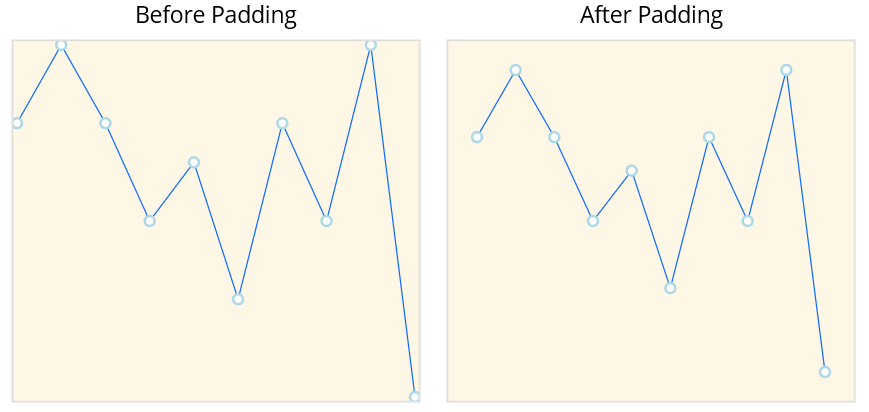
The Padding property represents the distance between the spark chart and its surrounding plot area. Padding can be applied in a specific direction or in all directions. The default value is 0. Padding can be applied to all spark chart types.
<sparkchart:SfSparkLineChart ItemsSource="{Binding Data}"
                    Padding="20"
                    ShowMarkers="True"
                    YBindingPath="Value">
    <sparkchart:SfSparkLineChart.BindingContext>
        <model:SparkChartViewModel/>
    </sparkchart:SfSparkLineChart.BindingContext>

    <sparkchart:SfSparkLineChart.MarkerSettings>
        <sparkchart:SparkChartMarkerSettings
            Fill="white"
            StrokeWidth="2"
            Stroke="LightBlue"
            Height="8"
            Width="8"
            ShapeType="Circle"/>
    </sparkchart:SfSparkLineChart.MarkerSettings>
</sparkchart:SfSparkLineChart>
var viewModel = new SparkChartViewModel();
SfSparkLineChart sparkchart = new SfSparkLineChart()
{
BindingContext = viewModel,
ItemsSource = viewModel.Data,
Padding = new Thickness(20),
ShowMarkers = true,
YBindingPath = "Value",
MarkerSettings = new SparkChartMarkerSettings
{
Fill= Colors.White,
StrokeWidth = 2,
Stroke = new SolidColorBrush(Colors.LightBlue),
Height = 8,
Width = 8,
ShapeType = SparkChartMarkerShape.Circle
}
};
this.Content = sparkchart;