Set Sliding Panel Content in .NET MAUI Navigation Drawer
The drawer pane content is only viewable when the drawer is in the open state. Its content can be set as:
-
Header Content
-
Drawer Content
-
Footer Content
Header and Footer content is optional, but the Drawer content is mandatory to allocate space for the drawer.
Header content
The header is displayed at the top of the drawer. Use the DrawerHeaderView property to set the header content:
<navigationdrawer:SfNavigationDrawer x:Name="navigationDrawer">
    <navigationdrawer:SfNavigationDrawer.DrawerSettings>
        <navigationdrawer:DrawerSettings>
            <navigationdrawer:DrawerSettings.DrawerHeaderView>
                <Grid BackgroundColor="#6750A4">
                    <Label Text="Header View"
                            TextColor="White"
                            HorizontalOptions="Center"
                            VerticalOptions="Center"/>
                </Grid>
            </navigationdrawer:DrawerSettings.DrawerHeaderView>
        </navigationdrawer:DrawerSettings>
    </navigationdrawer:SfNavigationDrawer.DrawerSettings>
</navigationdrawer:SfNavigationDrawer>
SfNavigationDrawer navigationDrawer = new SfNavigationDrawer();
DrawerSettings drawerSettings = new DrawerSettings();
Grid headerGrid = new Grid()
{
BackgroundColor = Color.FromArgb("#6750A4"),
};
Label headerLabel = new Label()
{
Text = "Header View",
TextColor = Colors.White,
HorizontalOptions = LayoutOptions.Center,
VerticalOptions = LayoutOptions.Center,
};
headerGrid.Children.Add(headerLabel);
drawerSettings.DrawerHeaderView = headerGrid;
navigationDrawer.DrawerSettings = drawerSettings;
this.Content = navigationDrawer;
Header height
Adjust the height of the drawer header content using the DrawerHeaderHeight property.
The DrawerHeaderView can be removed by setting the DrawerHeaderHeight to zero.
<navigationdrawer:SfNavigationDrawer x:Name="navigationDrawer">
    <navigationdrawer:SfNavigationDrawer.DrawerSettings>
        <navigationdrawer:DrawerSettings DrawerHeaderHeight="150">
            <navigationdrawer:DrawerSettings.DrawerHeaderView>
                <Grid BackgroundColor="#6750A4">
                    <Label Text="Header View"
                            TextColor="White"
                            HorizontalOptions="Center"
                            VerticalOptions="Center"/>
                </Grid>
            </navigationdrawer:DrawerSettings.DrawerHeaderView>
        </navigationdrawer:DrawerSettings>
    </navigationdrawer:SfNavigationDrawer.DrawerSettings>
</navigationdrawer:SfNavigationDrawer>
SfNavigationDrawer navigationDrawer = new SfNavigationDrawer();
DrawerSettings drawerSettings = new DrawerSettings()
{
DrawerHeaderHeight = 150,
};
Grid headerGrid = new Grid()
{
BackgroundColor = Color.FromArgb("#6750A4"),
};
Label headerLabel = new Label()
{
Text = "Header View",
TextColor = Colors.White,
HorizontalOptions = LayoutOptions.Center,
VerticalOptions = LayoutOptions.Center,
};
headerGrid.Children.Add(headerLabel);
drawerSettings.DrawerHeaderView = headerGrid;
navigationDrawer.DrawerSettings = drawerSettings;
this.Content = navigationDrawer;
Footer content
The footer is displayed at the bottom of the drawer. Use the DrawerFooterView property to set the footer content:
<navigationdrawer:SfNavigationDrawer x:Name="navigationDrawer">
    <navigationdrawer:SfNavigationDrawer.DrawerSettings>
        <navigationdrawer:DrawerSettings>
            <navigationdrawer:DrawerSettings.DrawerFooterView>
                <Grid BackgroundColor="#6750A4">
                    <Label Text="Footer View"
                        TextColor="White"
                        HorizontalOptions="Center"
                        VerticalOptions="Center"/>
                </Grid>
            </navigationdrawer:DrawerSettings.DrawerFooterView>
        </navigationdrawer:DrawerSettings>
    </navigationdrawer:SfNavigationDrawer.DrawerSettings>
</navigationdrawer:SfNavigationDrawer>
SfNavigationDrawer navigationDrawer = new SfNavigationDrawer();
DrawerSettings drawerSettings = new DrawerSettings();
Grid footerGrid = new Grid()
{
BackgroundColor = Color.FromArgb("#6750A4"),
};
Label footerLabel = new Label()
{
Text = "Footer View",
TextColor = Colors.White,
HorizontalOptions = LayoutOptions.Center,
VerticalOptions = LayoutOptions.Center,
};
footerGrid.Children.Add(footerLabel);
drawerSettings.DrawerFooterView = footerGrid;
navigationDrawer.DrawerSettings = drawerSettings;
this.Content = navigationDrawer;
Footer height
Adjust the height of the drawer footer content using the DrawerFooterHeight property.
The DrawerFooterView can be removed by setting the DrawerFooterHeight to zero.
<navigationdrawer:SfNavigationDrawer x:Name="navigationDrawer">
    <navigationdrawer:SfNavigationDrawer.DrawerSettings>
        <navigationdrawer:DrawerSettings DrawerFooterHeight="150">
            <navigationdrawer:DrawerSettings.DrawerFooterView>
                <Grid BackgroundColor="#6750A4">
                    <Label Text="Footer View"
                           TextColor="White"
                           HorizontalOptions="Center"
                           VerticalOptions="Center"/>
                </Grid>
            </navigationdrawer:DrawerSettings.DrawerFooterView>
        </navigationdrawer:DrawerSettings>
    </navigationdrawer:SfNavigationDrawer.DrawerSettings>
</navigationdrawer:SfNavigationDrawer>
SfNavigationDrawer navigationDrawer = new SfNavigationDrawer();
DrawerSettings drawerSettings = new DrawerSettings()
{
DrawerFooterHeight = 150,
};
Grid footerGrid = new Grid()
{
BackgroundColor = Color.FromArgb("#6750A4"),
};
Label footerLabel = new Label()
{
Text = "Footer View",
TextColor = Colors.White,
HorizontalOptions = LayoutOptions.Center,
VerticalOptions = LayoutOptions.Center,
};
footerGrid.Children.Add(footerLabel);
drawerSettings.DrawerFooterView = footerGrid;
navigationDrawer.DrawerSettings = drawerSettings;
this.Content = navigationDrawer;
Drawer content
The main content of the drawer is displayed between the header and footer content. It can be set using the DrawerContentView property. The content view occupies the space left by the header and footer content.
<navigationdrawer:SfNavigationDrawer x:Name="navigationDrawer">
    <navigationdrawer:SfNavigationDrawer.DrawerSettings>
        <navigationdrawer:DrawerSettings>
            <navigationdrawer:DrawerSettings.DrawerContentView>
                <Grid BackgroundColor="#6750A4">
                    <Label Text="Drawer Content"
                           TextColor="White"
                           HorizontalOptions="Center"
                           VerticalOptions="Center"/>
                </Grid>
            </navigationdrawer:DrawerSettings.DrawerContentView>
        </navigationdrawer:DrawerSettings>
    </navigationdrawer:SfNavigationDrawer.DrawerSettings>
</navigationdrawer:SfNavigationDrawer>
SfNavigationDrawer navigationDrawer = new SfNavigationDrawer();
DrawerSettings drawerSettings = new DrawerSettings();
Grid contentGrid = new Grid()
{
BackgroundColor = Color.FromArgb("#6750A4"),
};
Label contentLabel = new Label()
{
Text = "Drawer Content",
TextColor = Colors.White,
HorizontalOptions = LayoutOptions.Center,
VerticalOptions = LayoutOptions.Center,
};
contentGrid.Children.Add(contentLabel);
drawerSettings.DrawerContentView = contentGrid;
navigationDrawer.DrawerSettings = drawerSettings;
this.Content = navigationDrawer;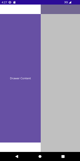
Drawer content background
You can customize the background color of the drawer’s content area by setting the ContentBackground property in DrawerSettings.
<navigationdrawer:SfNavigationDrawer x:Name="navigationDrawer">
    <navigationdrawer:SfNavigationDrawer.DrawerSettings>
        <navigationdrawer:DrawerSettings ContentBackground="Red">
            <navigationdrawer:DrawerSettings.DrawerContentView>
                <Grid BackgroundColor="#6750A4">
                    <VerticalStackLayout VerticalOptions="Center"
                     HorizontalOptions="Center">
                        <Label Text="Drawer Content"/>
                    </VerticalStackLayout>
                </Grid>
            </navigationdrawer:DrawerSettings.DrawerContentView>
        </navigationdrawer:DrawerSettings>
    </navigationdrawer:SfNavigationDrawer.DrawerSettings>
</navigationdrawer:SfNavigationDrawer>
SfNavigationDrawer navigationDrawer = new SfNavigationDrawer();
DrawerSettings drawerSettings = new DrawerSettings()
{
ContentBackground = Colors.Red
};
navigationDrawer.DrawerSettings = drawerSettings;
this.Content = navigationDrawer;