---
layout: post
title: React Grid - Filtering | Syncfusion
description: React Grid filtering provides a comprehensive guide to available filter types, configuration, server filtering, and UI options for data refinement.
control: Filtering
platform: grid-sdk
documentation: ug
domainurl: https://help.syncfusion.com/grid-sdk
---
# Filtering in React Grid component
Filtering is a powerful feature in the React DataGrid component that enables selective viewing of data based on specific criteria. It allows narrowing down large datasets to focus on relevant information, thereby enhancing data analysis and decision-making.
For an overview of the filtering feature available in the React Grid, refer to the following video:
{% youtube "https://www.youtube.com/watch?v=G5ocVU3EWsw" %}
For an overview of the filtering feature available in the React Grid, refer to the following video:
{% youtube "https://www.youtube.com/watch?v=G5ocVU3EWsw" %}
## Set up filtering
Before using filtering in the grid, understand that the component needs the `Filter module` to unlock all filtering features.
Inject the [Filter](https://ej2.syncfusion.com/react/documentation/api/grid/filter) module into the Grid component's `Inject` services array to enable filtering.
```js
import { Inject, Filter } from '@syncfusion/ej2-react-grids';
```
## Enable filtering
To enable the filtering functionality in the Grid, set [allowFiltering](https://ej2.syncfusion.com/react/documentation/api/grid#allowfiltering) property to `true`. The [filterSettings](https://ej2.syncfusion.com/react/documentation/api/grid/filterSettings) property configures filtering behavior and criteria.
Here is an example demonstrating the default filtering feature:
{% tabs %}
{% highlight js tabtitle="App.jsx" %}
{% include code-snippet/grid-sdk/react/data-grid/filter-cs8/app/App.jsx %}
{% endhighlight %}
{% highlight ts tabtitle="App.tsx" %}
{% include code-snippet/grid-sdk/react/data-grid/filter-cs8/app/App.tsx %}
{% endhighlight %}
{% highlight js tabtitle="datasource.jsx" %}
{% include code-snippet/grid-sdk/react/data-grid/filter-cs8/app/datasource.jsx %}
{% endhighlight %}
{% highlight ts tabtitle="datasource.tsx" %}
{% include code-snippet/grid-sdk/react/data-grid/filter-cs8/app/datasource.tsx %}
{% endhighlight %}
{% endtabs %}
{% previewsample "https://help.syncfusion.com/code-snippet/grid-sdk/react/data-grid/filter-cs8" %}
> * Apply and clear filtering programmatically using [filterByColumn](https://ej2.syncfusion.com/react/documentation/api/grid/filter#filterbycolumn) and [clearFiltering](https://ej2.syncfusion.com/react/documentation/api/grid/filter#clearfiltering) methods.
> * Disable filtering for a particular column by setting its [allowFiltering](https://ej2.syncfusion.com/react/documentation/api/grid/column#allowfiltering) property to `false`.
## Initial filter
Apply filters automatically when the Grid loads by specifying filter criteria using a predicate object. A predicate object defines the filter condition with three key properties:
* `field`: The column name to filter.
* `operator`: The comparison type (equal, startswith, greaterthan, etc.).
* `value`: The filter criterion to match.
Configure initial filters in [filterSettings.columns](https://ej2.syncfusion.com/react/documentation/api/grid/filterSettingsModel#columns).
{% tabs %}
{% highlight js tabtitle="App.jsx" %}
{% include code-snippet/grid-sdk/react/data-grid/filter-cs9/app/App.jsx %}
{% endhighlight %}
{% highlight ts tabtitle="App.tsx" %}
{% include code-snippet/grid-sdk/react/data-grid/filter-cs9/app/App.tsx %}
{% endhighlight %}
{% highlight js tabtitle="datasource.jsx" %}
{% include code-snippet/grid-sdk/react/data-grid/filter-cs9/app/datasource.jsx %}
{% endhighlight %}
{% highlight ts tabtitle="datasource.tsx" %}
{% include code-snippet/grid-sdk/react/data-grid/filter-cs9/app/datasource.tsx %}
{% endhighlight %}
{% endtabs %}
{% previewsample "https://help.syncfusion.com/code-snippet/grid-sdk/react/data-grid/filter-cs9" %}
### Initial filter with multiple values for same column
Initial filtering with multiple values allows to preset filter conditions for a specific column using multiple criteria. This displays only records matching any of the specified values when the grid first renders.
Set multiple [predicate](https://ej2.syncfusion.com/react/documentation/api/grid/predicate) objects in [filterSettings.columns](https://ej2.syncfusion.com/react/documentation/api/grid/filterSettingsModel#columns) for the same field.
The following example filters the "Customer ID" column to show only specific customer records.
{% tabs %}
{% highlight js tabtitle="App.jsx" %}
{% include code-snippet/grid-sdk/react/data-grid/filter-cs20/app/App.jsx %}
{% endhighlight %}
{% highlight ts tabtitle="App.tsx" %}
{% include code-snippet/grid-sdk/react/data-grid/filter-cs20/app/App.tsx %}
{% endhighlight %}
{% highlight js tabtitle="datasource.jsx" %}
{% include code-snippet/grid-sdk/react/data-grid/filter-cs20/app/datasource.jsx %}
{% endhighlight %}
{% highlight ts tabtitle="datasource.tsx" %}
{% include code-snippet/grid-sdk/react/data-grid/filter-cs20/app/datasource.tsx %}
{% endhighlight %}
{% endtabs %}
{% previewsample "https://help.syncfusion.com/code-snippet/grid-sdk/react/data-grid/filter-cs20" %}
### Initial filter with multiple values for different columns
Initial filter configuration with multiple values across different columns sets predefined filter criteria for each column. This configuration displays filtered records immediately when the grid loads.
The following example filters both "Order ID" and "Customer ID" columns simultaneously.
{% tabs %}
{% highlight js tabtitle="App.jsx" %}
{% include code-snippet/grid-sdk/react/data-grid/filter-cs21/app/App.jsx %}
{% endhighlight %}
{% highlight ts tabtitle="App.tsx" %}
{% include code-snippet/grid-sdk/react/data-grid/filter-cs21/app/App.tsx %}
{% endhighlight %}
{% highlight js tabtitle="datasource.jsx" %}
{% include code-snippet/grid-sdk/react/data-grid/filter-cs21/app/datasource.jsx %}
{% endhighlight %}
{% highlight ts tabtitle="datasource.tsx" %}
{% include code-snippet/grid-sdk/react/data-grid/filter-cs21/app/datasource.tsx %}
{% endhighlight %}
{% endtabs %}
{% previewsample "https://help.syncfusion.com/code-snippet/grid-sdk/react/data-grid/filter-cs21" %}
## Filter operators
The Grid provides various filter operators to define filter conditions for columns. Define the filter operator using the [operator](https://ej2.syncfusion.com/react/documentation/api/grid/predicateModel#operator) property in [filterSettings.columns](https://ej2.syncfusion.com/react/documentation/api/grid/filterSettings#columns).
The available operators and their supported data types are:
Operator |Description |Supported Types
-----|-----|-----
startsWith |Checks whether a value begins with the specified value. |String
endsWith |Checks whether a value ends with specified value. |String
contains |Checks whether a value contains the specified value. |String
doesnotstartwith |Checks whether the value does not begin with the specified value. |String
doesnotendwith |Checks whether the value does not end with the specified value. |String
doesnotcontain |Checks whether the value does not contain the specified value. |String
equal |Checks whether a value equals the specified value. |String | Number | Boolean | Date
notEqual |Checks whether a value does not equal the specified value. |String | Number | Boolean | Date
greaterThan |Checks whether a value is greater than the specified value. |Number | Date
greaterThanOrEqual|Checks whether a value is greater than or equal to the specified value. |Number | Date
lessThan |Checks whether a value is less than the specified value. |Number | Date
lessThanOrEqual |Checks whether a value is less than or equal to the specified value. |Number | Date
isnull |Returns values that are null. |String | Number | Date
isnotnull |Returns values that are not null. |String | Number | Date
isempty |Returns values that are empty. |String
isnotempty |Returns values that are not empty. |String
between|Filters values within a range between the start and end specified values. |Number | Date
in |Filters multiple records in the same column that exactly match any of the selected values. |String | Number | Date
notin |Filters multiple records in the same column that do not match any of the selected values. |String | Number | Date
> By default, the Grid uses different filter operators for different column types. The default filter operator for string columns is "startswith", for numeric columns is "equal", and for boolean columns is "equal".
## Wildcard and like operator filter
"Wildcard" and "like" operators filter values based on string patterns and apply to string-type columns. They work slightly differently in pattern matching.
### Wildcard filtering
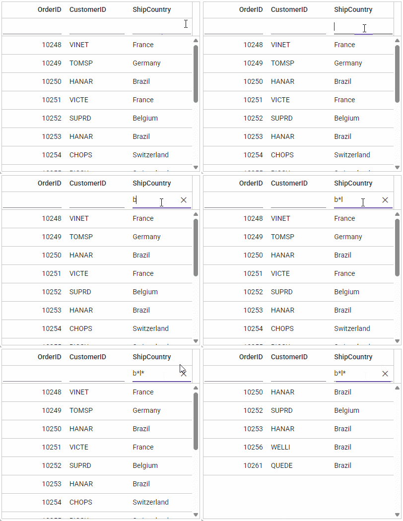
The "Wildcard" filter processes one or more search patterns using the "*" symbol, retrieving values matching the specified patterns. Wildcard characters match any sequence of characters in a search pattern.
**For example:**
Operator |Description
-----|-----
a*b |Everything that starts with "a" and ends with "b".
a* |Everything that starts with "a".
*b |Everything that ends with "b".
*a* |Everything that has an "a" in it.
*a*b* |Everything that has an "a" in it, followed by anything, followed by a "b", followed by anything.
### Like filtering
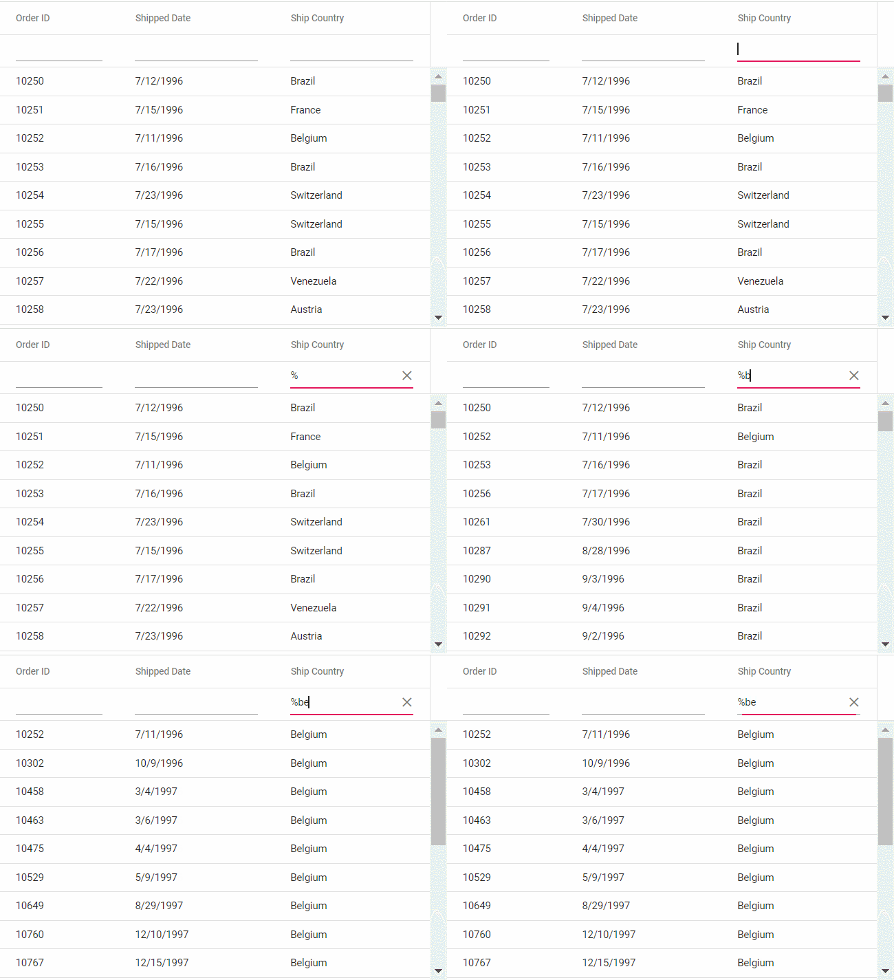
The "like" filter processes search patterns using the "%" symbol, retrieving values matching the specified patterns. The following Grid features support like filtering on string-type columns:
* Filter Menu
* Filter Bar with the [filterSettings.showFilterBarOperator](https://ej2.syncfusion.com/react/documentation/api/grid/filter#showFilterBarOperator) property enabled
* Custom Filter of Excel filter type
**For example:**
Operator |Description
-----|-----
%ab% |Returns all values containing the "ab" character sequence.
ab% |Returns all values ending with the "ab" character sequence.
%ab |Returns all values starting with the "ab" character sequence.
## Diacritics filter
The diacritics filter feature handles text data that includes accented characters. Diacritics are accent marks added to letters (examples: é, ñ, ü, ç). By default, the grid ignores these characters during filtering.
This feature is essential for international data where names like "José" and "Jose" should be treated differently (or the same, depending on requirements).
Enable diacritic character consideration by setting [filterSettings.ignoreAccent](https://ej2.syncfusion.com/react/documentation/api/grid/filter#filterbycolumn) to `true`.
The following example includes diacritic characters in the filtering process:
{% tabs %}
{% highlight js tabtitle="App.jsx" %}
{% include code-snippet/grid-sdk/react/data-grid/filter-diacritics-cs1/app/App.jsx %}
{% endhighlight %}
{% highlight ts tabtitle="App.tsx" %}
{% include code-snippet/grid-sdk/react/data-grid/filter-diacritics-cs1/app/App.tsx %}
{% endhighlight %}
{% highlight js tabtitle="datasource.jsx" %}
{% include code-snippet/grid-sdk/react/data-grid/filter-diacritics-cs1/app/datasource.jsx %}
{% endhighlight %}
{% highlight ts tabtitle="datasource.tsx" %}
{% include code-snippet/grid-sdk/react/data-grid/filter-diacritics-cs1/app/datasource.tsx %}
{% endhighlight %}
{% endtabs %}
{% previewsample "https://help.syncfusion.com/code-snippet/grid-sdk/react/data-grid/filter-diacritics-cs1" %}
## Perform ENUM column filtering
The Grid allows filtering enum-type data using the [filterTemplate](https://ej2.syncfusion.com/react/documentation/api/grid/column#filtertemplate) feature. Enumerated values (enum) are predefined fixed options, such as status categories (Active, Inactive, Pending) or priority levels (High, Medium, Low). This is particularly useful for filtering columns with dropdown-based data.
To filter columns containing enum values, follow the steps below:
1. Render [DropDownList](https://ej2.syncfusion.com/react/documentation/drop-down-list/getting-started) in the `filterTemplate` for the enum-type column.
2. Bind the enumerated list data to the column.
3. Use the [template](https://ej2.syncfusion.com/react/documentation/api/grid/column#template) property in the "Type" column to display enum values in a readable format.
4. In the [change](https://ej2.syncfusion.com/react/documentation/api/drop-down-list#change) event of the `DropDownList`, dynamically filter the column using the [filterByColumn](https://ej2.syncfusion.com/react/documentation/api/grid#filterbycolumn) method.
{% tabs %}
{% highlight js tabtitle="App.jsx" %}
{% include code-snippet/grid-sdk/react/data-grid/filtering-enum/app/App.jsx %}
{% endhighlight %}
{% highlight ts tabtitle="App.tsx" %}
{% include code-snippet/grid-sdk/react/data-grid/filtering-enum/app/App.tsx %}
{% endhighlight %}
{% highlight js tabtitle="datasource.jsx" %}
{% include code-snippet/grid-sdk/react/data-grid/filtering-enum/app/datasource.jsx %}
{% endhighlight %}
{% highlight ts tabtitle="datasource.tsx" %}
{% include code-snippet/grid-sdk/react/data-grid/filtering-enum/app/datasource.tsx %}
{% endhighlight %}
{% endtabs %}
{% previewsample "https://help.syncfusion.com/code-snippet/grid-sdk/react/data-grid/filtering-enum" %}
## Filtering with case sensitivity
The Grid provides the flexibility to enable or disable case sensitivity during filtering. Control whether filtering operations consider the case of characters using the [enableCaseSensitivity](https://ej2.syncfusion.com/react/documentation/api/grid/filterSettings#enablecasesensitivity) property within [filterSettings](https://ej2.syncfusion.com/react/documentation/api/grid/filterSettings).
Below is an example demonstrating how to toggle case sensitivity.
{% tabs %}
{% highlight js tabtitle="App.jsx" %}
{% include code-snippet/grid-sdk/react/data-grid/filter-cs12/app/App.jsx %}
{% endhighlight %}
{% highlight ts tabtitle="App.tsx" %}
{% include code-snippet/grid-sdk/react/data-grid/filter-cs12/app/App.tsx %}
{% endhighlight %}
{% highlight js tabtitle="datasource.jsx" %}
{% include code-snippet/grid-sdk/react/data-grid/filter-cs12/app/datasource.jsx %}
{% endhighlight %}
{% highlight ts tabtitle="datasource.tsx" %}
{% include code-snippet/grid-sdk/react/data-grid/filter-cs12/app/datasource.tsx %}
{% endhighlight %}
{% endtabs %}
{% previewsample "https://help.syncfusion.com/code-snippet/grid-sdk/react/data-grid/filter-cs12" %}
## Enable different filter for a column
The Grid offers flexibility to customize filtering behavior for different columns by enabling various filter types such as `Menu`, `Excel`, or `CheckBox`. This allows tailoring the filtering experience to suit specific column needs. For example, use a menu-based filter for a category column, an Excel-like filter for a date column, and a checkbox filter for a status column.
Adjust the [filter.type](https://ej2.syncfusion.com/react/documentation/api/grid/column#filter) property based on requirements.
Here's an example where the menu filter is enabled by default, but filter types can be dynamically modified through a dropdown.
{% tabs %}
{% highlight js tabtitle="App.jsx" %}
{% include code-snippet/grid-sdk/react/data-grid/filter-cs13/app/App.jsx %}
{% endhighlight %}
{% highlight ts tabtitle="App.tsx" %}
{% include code-snippet/grid-sdk/react/data-grid/filter-cs13/app/App.tsx %}
{% endhighlight %}
{% highlight js tabtitle="datasource.jsx" %}
{% include code-snippet/grid-sdk/react/data-grid/filter-cs13/app/datasource.jsx %}
{% endhighlight %}
{% highlight ts tabtitle="datasource.tsx" %}
{% include code-snippet/grid-sdk/react/data-grid/filter-cs13/app/datasource.tsx %}
{% endhighlight %}
{% endtabs %}
{% previewsample "https://help.syncfusion.com/code-snippet/grid-sdk/react/data-grid/filter-cs13" %}
## Change default filter operator for particular column
The Grid provides flexibility to change the default filter operator for a particular column. By default, the filter operator for string columns is `startswith`, for numeric columns is `equal`, and for boolean columns is `equal`. Customize the filter operator to better match the nature of the data using the "operator" property within [filterSettings](https://ej2.syncfusion.com/react/documentation/api/grid#filtersettings).
{% tabs %}
{% highlight js tabtitle="App.jsx" %}
{% include code-snippet/grid-sdk/react/data-grid/filter-cs14/app/App.jsx %}
{% endhighlight %}
{% highlight ts tabtitle="App.tsx" %}
{% include code-snippet/grid-sdk/react/data-grid/filter-cs14/app/App.tsx %}
{% endhighlight %}
{% highlight js tabtitle="datasource.jsx" %}
{% include code-snippet/grid-sdk/react/data-grid/filter-cs14/app/datasource.jsx %}
{% endhighlight %}
{% highlight ts tabtitle="datasource.tsx" %}
{% include code-snippet/grid-sdk/react/data-grid/filter-cs14/app/datasource.tsx %}
{% endhighlight %}
{% endtabs %}
{% previewsample "https://help.syncfusion.com/code-snippet/grid-sdk/react/data-grid/filter-cs14" %}
## Programmatic filtering
Programmatic filtering allows applying filters to specific columns without relying on user interface interactions. This is achieved using the [filterByColumn](https://ej2.syncfusion.com/react/documentation/api/grid#filterbycolumn) method.
The following example demonstrates programmatic filtering using single and multiple values for the "Order ID" and "Customer ID" columns. The `filterByColumn` method is called within an external button click function.
{% tabs %}
{% highlight js tabtitle="App.jsx" %}
{% include code-snippet/grid-sdk/react/data-grid/filter-cs22/app/App.jsx %}
{% endhighlight %}
{% highlight ts tabtitle="App.tsx" %}
{% include code-snippet/grid-sdk/react/data-grid/filter-cs22/app/App.tsx %}
{% endhighlight %}
{% highlight js tabtitle="datasource.jsx" %}
{% include code-snippet/grid-sdk/react/data-grid/filter-cs22/app/datasource.jsx %}
{% endhighlight %}
{% highlight ts tabtitle="datasource.tsx" %}
{% include code-snippet/grid-sdk/react/data-grid/filter-cs22/app/datasource.tsx %}
{% endhighlight %}
{% endtabs %}
{% previewsample "https://help.syncfusion.com/code-snippet/grid-sdk/react/data-grid/filter-cs22" %}
## How to get filtered records
Retrieving filtered records is essential when working with data matching currently applied filters. Achieve this using available methods and properties in the Grid component.
**1. Using the getFilteredRecords() method**
The [getFilteredRecords](https://ej2.syncfusion.com/react/documentation/api/grid#getfilteredrecords) method retrieves an array of records matching currently applied filters.
{% tabs %}
{% highlight js tabtitle="App.jsx" %}
{% raw %}
import { ButtonComponent } from '@syncfusion/ej2-react-buttons';
import { ColumnDirective, ColumnsDirective } from '@syncfusion/ej2-react-grids';
import { Filter, GridComponent, Inject, Page, PageSettingsModel } from '@syncfusion/ej2-react-grids'
import { MessageComponent } from '@syncfusion/ej2-react-notifications';
import React, { useState } from 'react';
import { data } from './datasource';
function App() {
let grid;
let filteredGrid;
const pageSettings = { pageSize: 10, pageCount: 5 };
let filteredData;
let showRecords;
let showWarning;
const [isFilteredGridVisible, setIsFilteredGridVisible] = useState(false);
const [isMsgWarningVisible, setIsMsgWarningVisible] = useState(false);
const getFilter = () => {
filteredData = grid.getFilteredRecords();
showRecords = filteredData.length > 0 ? true : false;
showWarning = !showRecords;
if (showRecords) {
filteredGrid.dataSource = filteredData;
}
setIsMsgWarningVisible(showWarning);
setIsFilteredGridVisible(showRecords);
}
const clear = () => {
grid.clearFiltering();
showRecords = false;
showWarning = false;
setIsMsgWarningVisible(false);
setIsFilteredGridVisible(false);
}
return (
Get Filtered Data
Clear
grid = g} dataSource={data} allowFiltering={true} pageSettings={pageSettings} allowPaging={true}>
Filtered Records
filteredGrid = fg} allowPaging={true}>
Get Filtered Data
Clear
grid = g} dataSource={data} allowFiltering={true} pageSettings={pageSettings} allowPaging={true}>
Filtered Records
filteredGrid = fg} allowPaging={true}>