Rows in ASP.NET Core Gantt Component
18 Nov 20182 minutes to read
Row represents a task information from the data source, and it is possible to perform the following actions in Gantt rows.
Row height
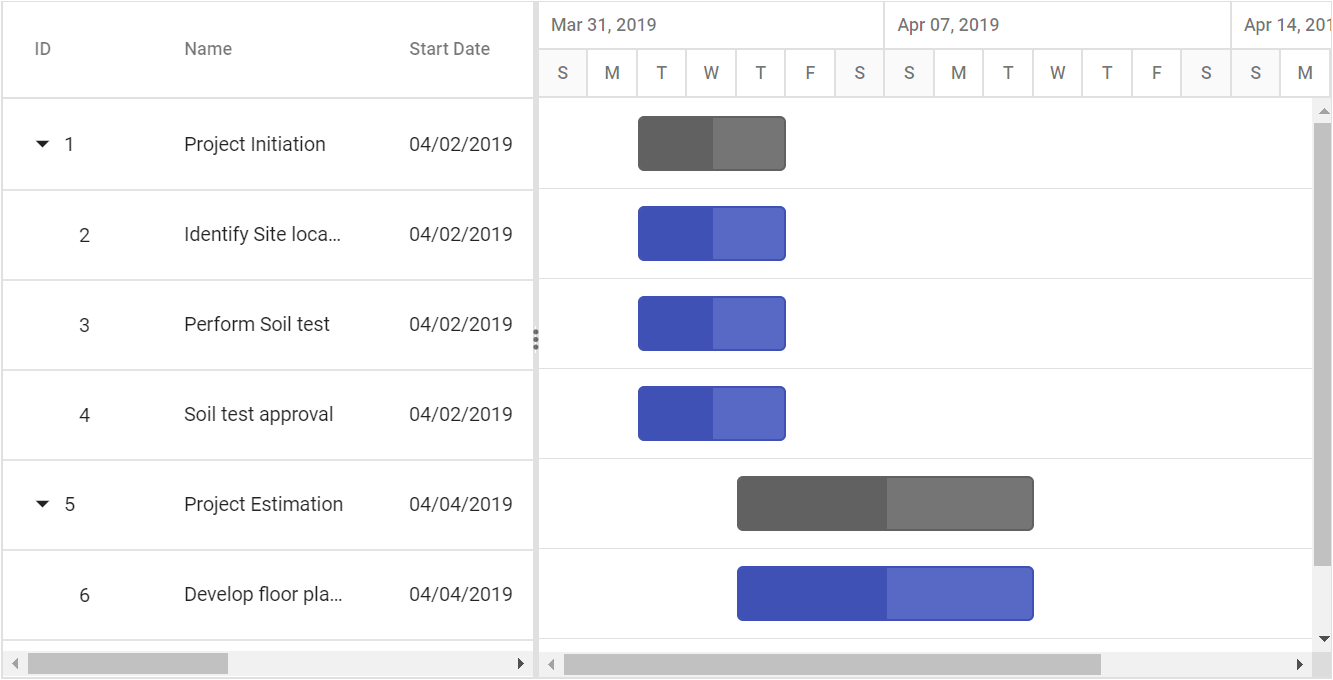
It is possible to change the height of the row in Gantt by setting row height in pixels to the RowHeight property. The following code example explains how to change the row height in Gantt at load time.
Expand/Collapse row
In Gantt parent tasks are expanded/collapsed by using expand/collapse icons, expand all/collapse all toolbar items and by using public methods. By default all tasks in Gantt was rendered in expanded state but we can change this status in Gantt.
Collapse all tasks at gantt chart load
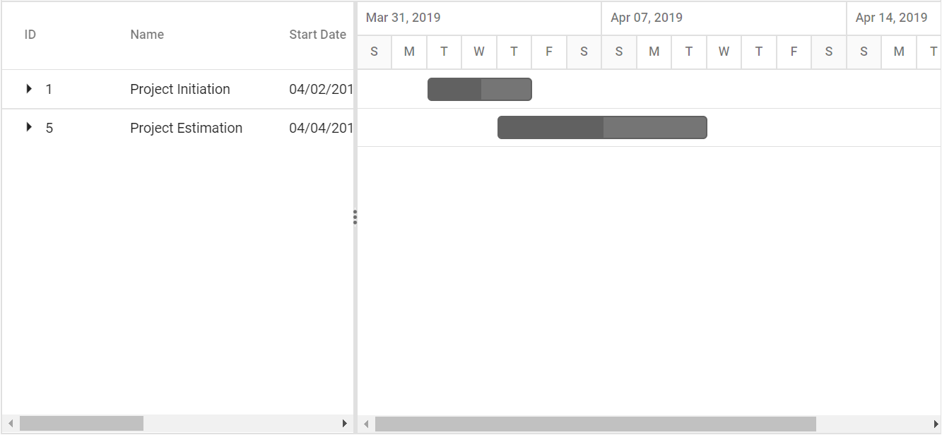
All tasks available in Gantt was rendered in collapsed state by setting CollapseAllParentTasks property as true. The following code example shows how to use this property.
Define expand/collapse status of tasks
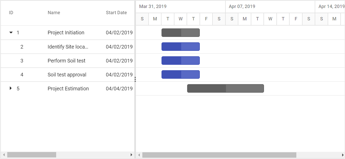
In Gantt, we can render some tasks in collapsed state and some tasks in expanded state, this can done by defining expand status of the task in data source. This value was mapped to Gantt control by using ExpandState property. The following code example shows how to use this property.
Customize expand/collapse action
On expand action Expanding and Expanded event will be triggered with current expanding row’s information. Similarly on collapse action Collapsing and Collapsed event will be triggered. Using this events and it’s arguments we can customize the expand/collapse action. The following code example shows how to prevent the particular row from expand/collapse action using Expanding and Collapsing event.
Customize rows
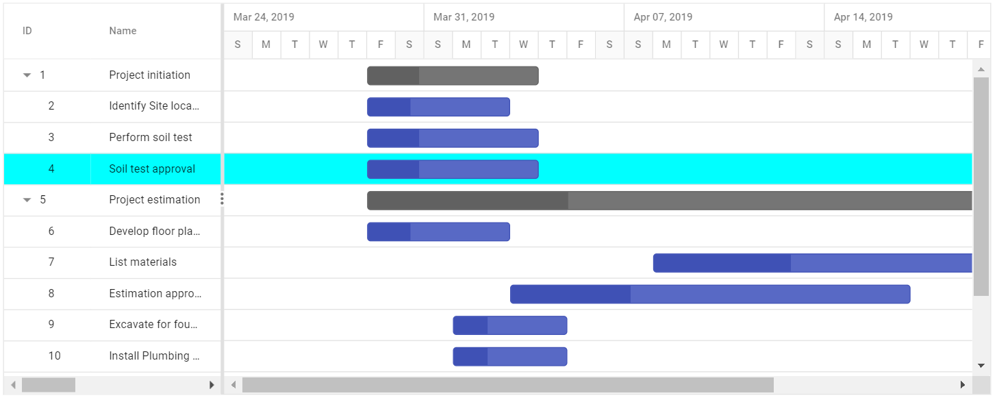
You can customize the appearance of a row in grid side, by using the rowDataBound event and in chart side by using queryTaskbarInfo event.
Styling alternate rows
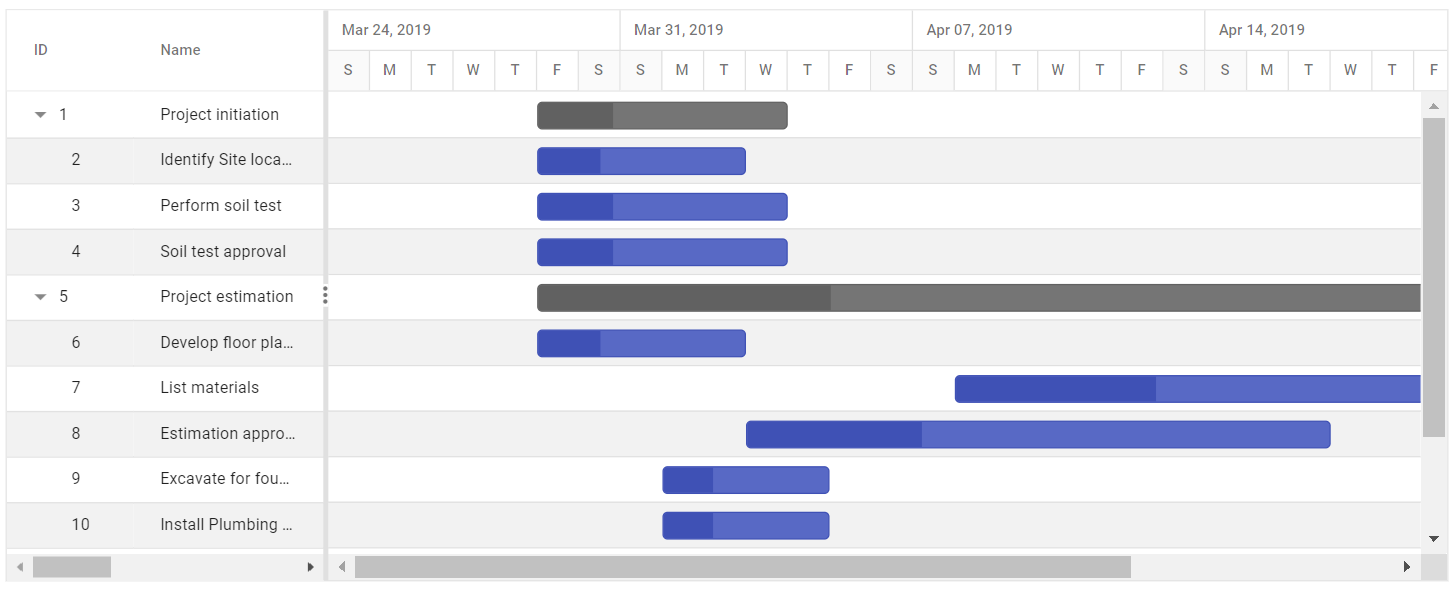
You can change the background colour of alternative rows in Gantt chart, by overriding the class as shown below.
.e-altrow, tr.e-chart-row:nth-child(even)  {
    background-color: #f2f2f2;
}
Row spanning
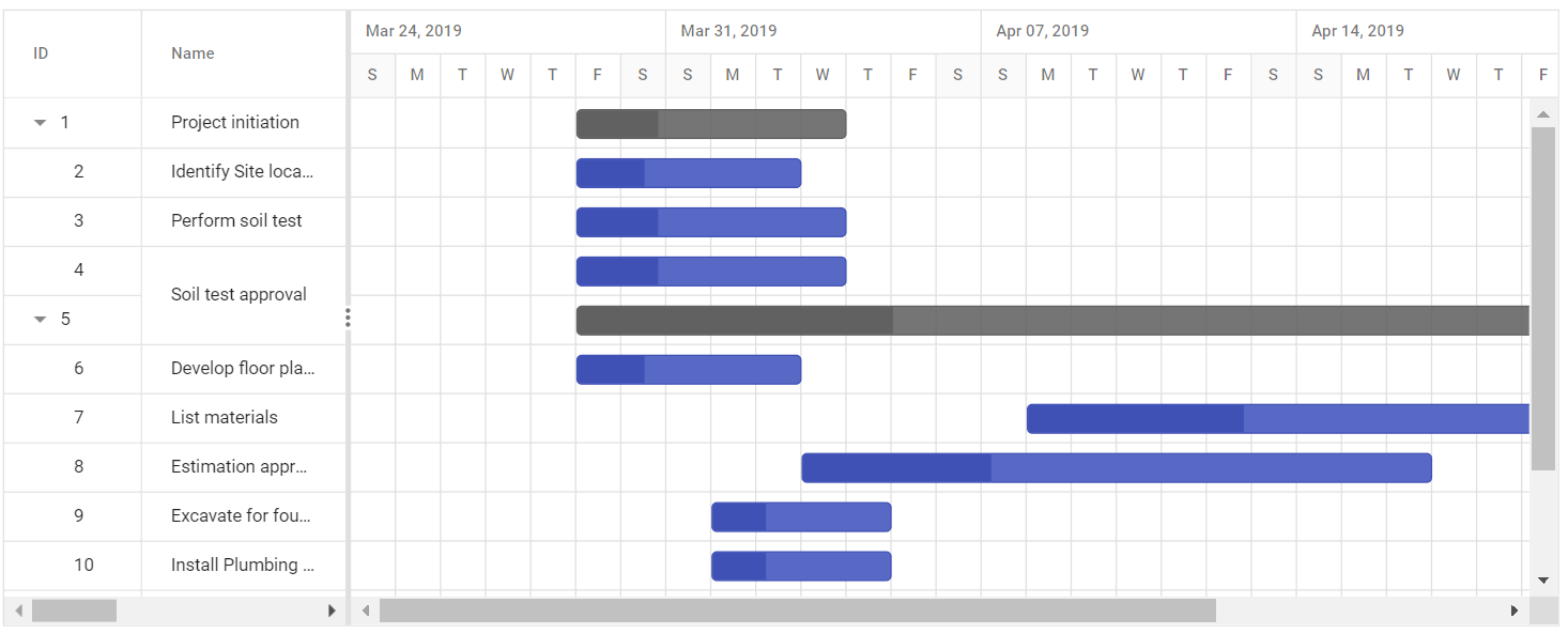
Gantt chart has an option to span row cells. You can achieve this using rowSpan attribute to span cells in the QueryCellInfo event.
In the following demo, Soil test approval cell is spanned to two rows in the TaskName column.
Customize rows and cells
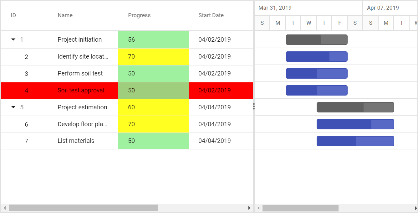
While rendering the TreeGrid part in Gantt, the RowDataBound and QueryCellInfo events trigger for every row and cell. Using these events, you can customize the rows and cells. The following code example shows how to customize the cell and row elements using these events.
Clip mode
The clip mode provides options to display its overflow cell content and it can be defined by the Columns.ClipMode property.
The following are three types of ClipMode:
-
Clip: Truncates the cell content when it overflows its area. -
Ellipsis: Displays ellipsis when content of the cell overflows its area. -
EllipsisWithTooltip: Displays ellipsis when content of the cell overflows its area; it displays the tooltip content when hover over ellipsis.
NOTE
By default, all the column’s
ClipModeproperty is defined asEllipsisWithTooltip.
Cell tooltip
You can enable or disable the Grid cell tooltip using the Columns.ClipMode property.