Toolbar overview in React PDF Viewer
4 Mar 20261 minute to read
Overview
This page provides a concise reference describing the toolbars available in the EJ2 React PDF Viewer component. It also explains what each toolbar is for and when it appears.
Scope: covers available toolbars and their functions.
List of Available Toolbars
Functional overview of each toolbar
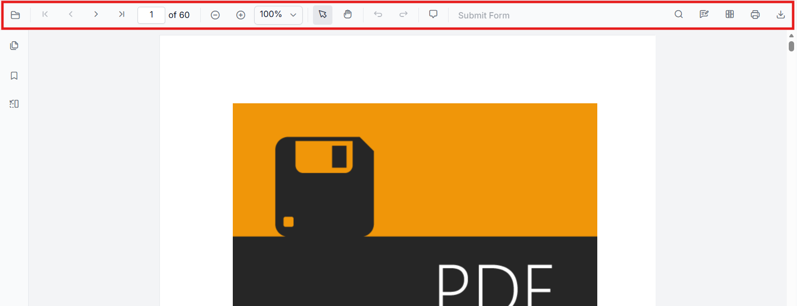
Primary toolbar
The primary toolbar presents core viewer actions such as open/load, page navigation, zoom controls, and print. It appears in standard desktop layouts and at the top of the viewer when Toolbar service is injected. Typical actions: page forward/back, zoom in/out, fit-to-page, print.
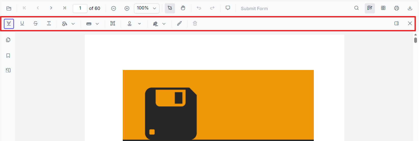
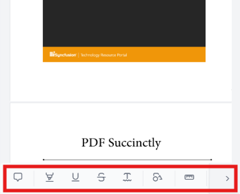
Annotation toolbar
The annotation toolbar surfaces annotation-related tools for adding, editing, and deleting annotations (text markup, shapes, stamps). It appears when annotation services are enabled and when a user opens annotation mode. Typical actions: highlight, underline, draw shape, add sticky note, delete annotation.
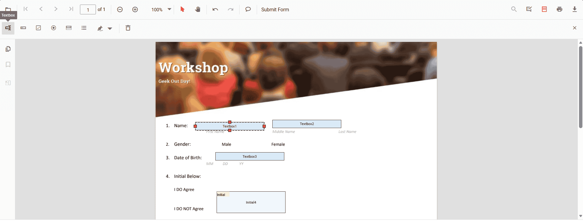
Form Designer toolbar
Form designer toolbar provides form-field authoring controls used when designing or editing form fields inside a PDF. It appears when FormDesigner is enabled (design mode) and contains actions for adding form field controls.
Mobile toolbar
-
A compact toolbar layout optimized for small screens and touch interactions. It appears automatically on mobile-sized view ports (or when a mobile layout is explicitly chosen) and contains the most frequently used actions in a space-efficient arrangement.
-
Annotation toolbar in mobile mode appears at the bottom of the PDF Viewer component.
Show or hide toolbar items
The following quick links describe how to customize, show, or hide specific toolbar items. Each linked page defines custom toolbar configurations and examples.
- Show or hide annotation toolbar items
- Show or hide form designer toolbar items
- Show or hide primary toolbar items
- Add a custom primary toolbar item