Create a React PDF Viewer with Agentic UI Builder
14 Aug 20262 minutes to read
This guide shows you how to create a Syncfusion React PDF Viewer simply by typing what you want using natural language commands — with the Syncfusion® React Agentic UI Builder (powered by Syncfusion’s MCP Server). Just describe it, and the tool builds the complete implementation of the PDF Viewer for you.
Prerequisites
- Ensure the React Agentic UI Builder extension is installed in your IDE. See the official installation guide.
- Have an existing React project ready (JavaScript or TypeScript, any supported version) before using the Agentic UI Builder.
Usage
After installation, open your React project in your IDE, launch the AI assistant, and run the #sf_react_ui_builder command describing the UI you want. For example:
Example:
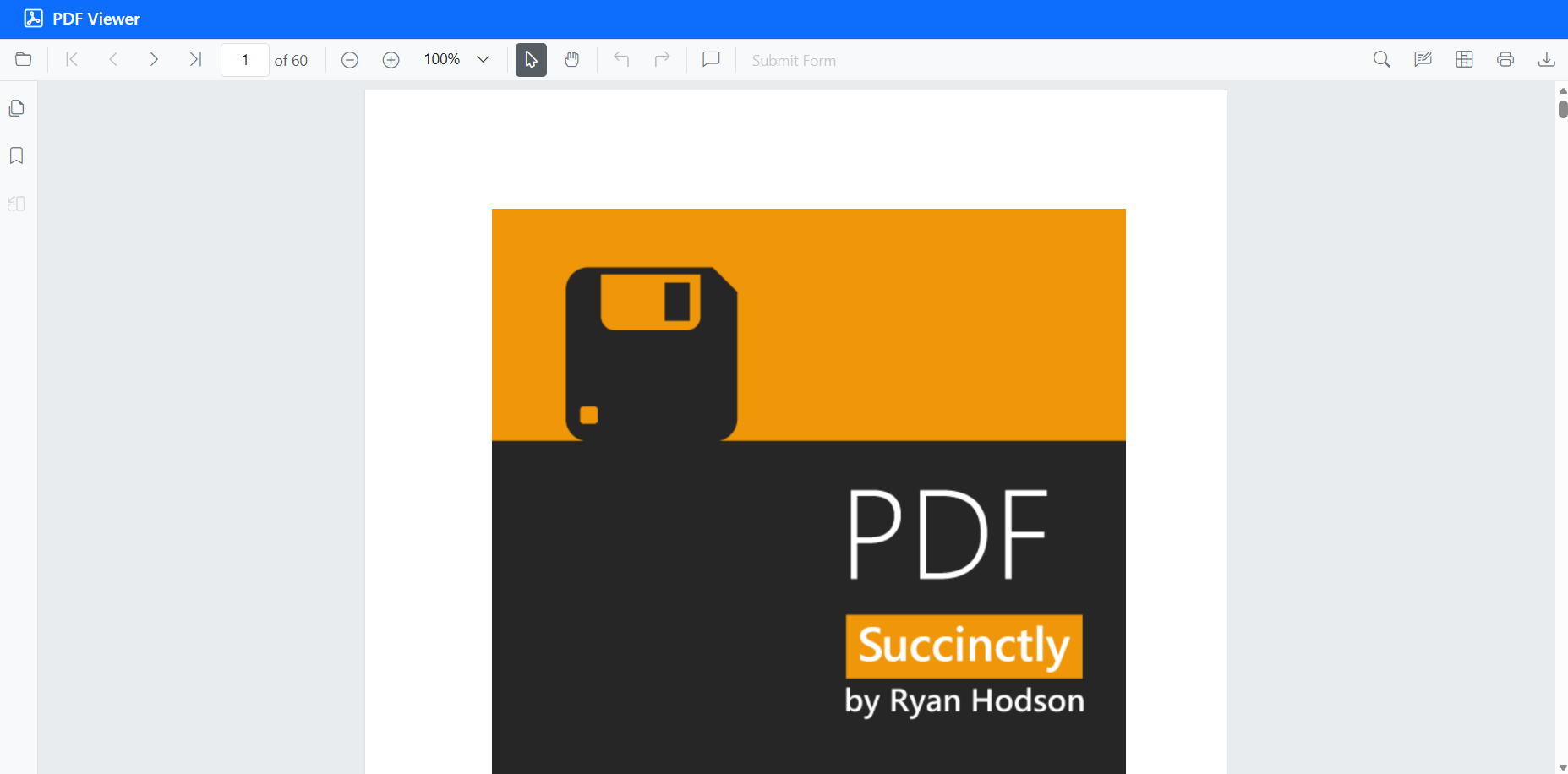
#sf_react_ui_builder Create standalone React PDF Viewer using the Bootstrap 5 theme with the default modules. Install the required packages, import the theme CSS in the correct order, and initialize the PDF Viewer.
The UI Builder delivers full implementations, covering layout, components, and styling. The following illustration shows the generated output:
Individual Tools
You can directly call individual tools using their specific tool names when you need focused assistance. This is helpful when you want targeted support from a particular tool.
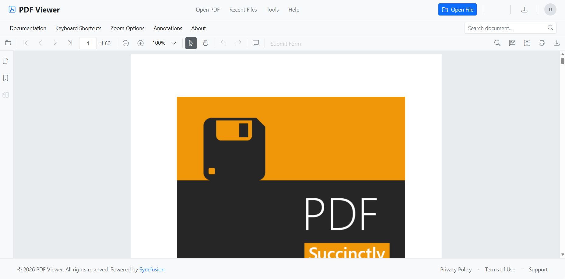
Layout Tool (#sf_react_layout)
This tool provides a collection of pre-built, responsive UI layout templates and blocks commonly used across different page sections and design patterns.
When to use: For creating page structures, responsive layouts, or using ready-made UI patterns.
Example:
#sf_react_layout Add a navigation bar and footer for PDF Viewer
Component Tool (#sf_react_component)
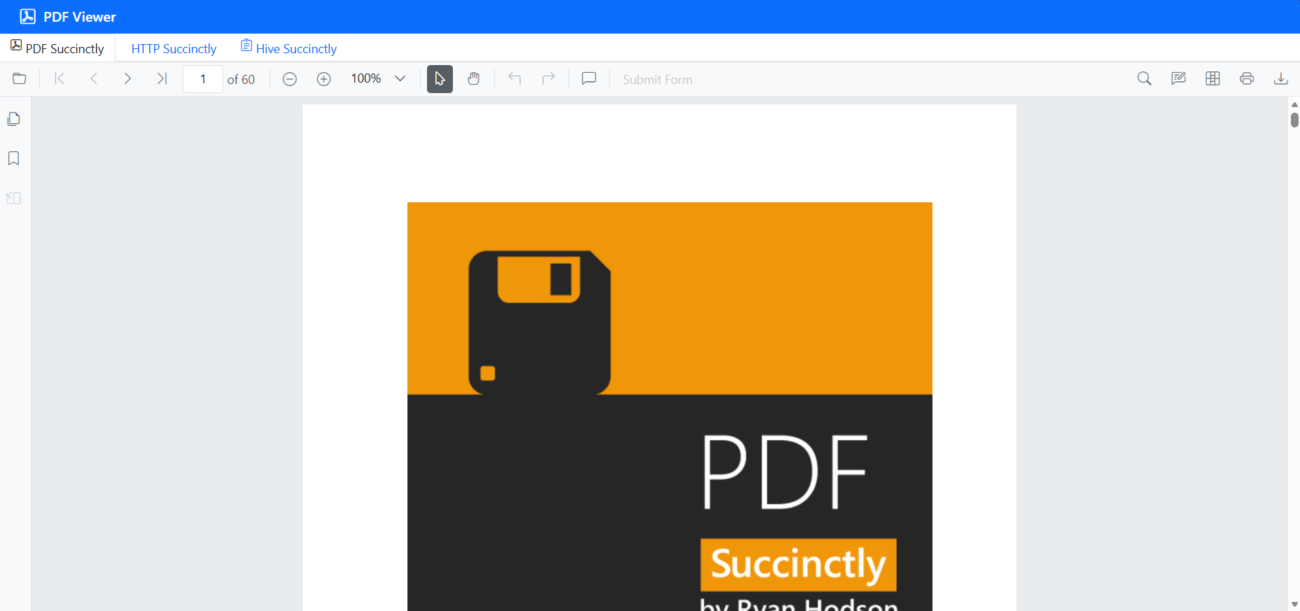
This tool offers quick reference details for Syncfusion React components, including their properties, events, and methods, along with basic usage examples.
When to use: When you need essential API information or structure details to correctly implement a specific component.
Example:
#sf_react_component Integrate a tab component in the existing PDF Viewer setup
Style Tool (#sf_react_style)
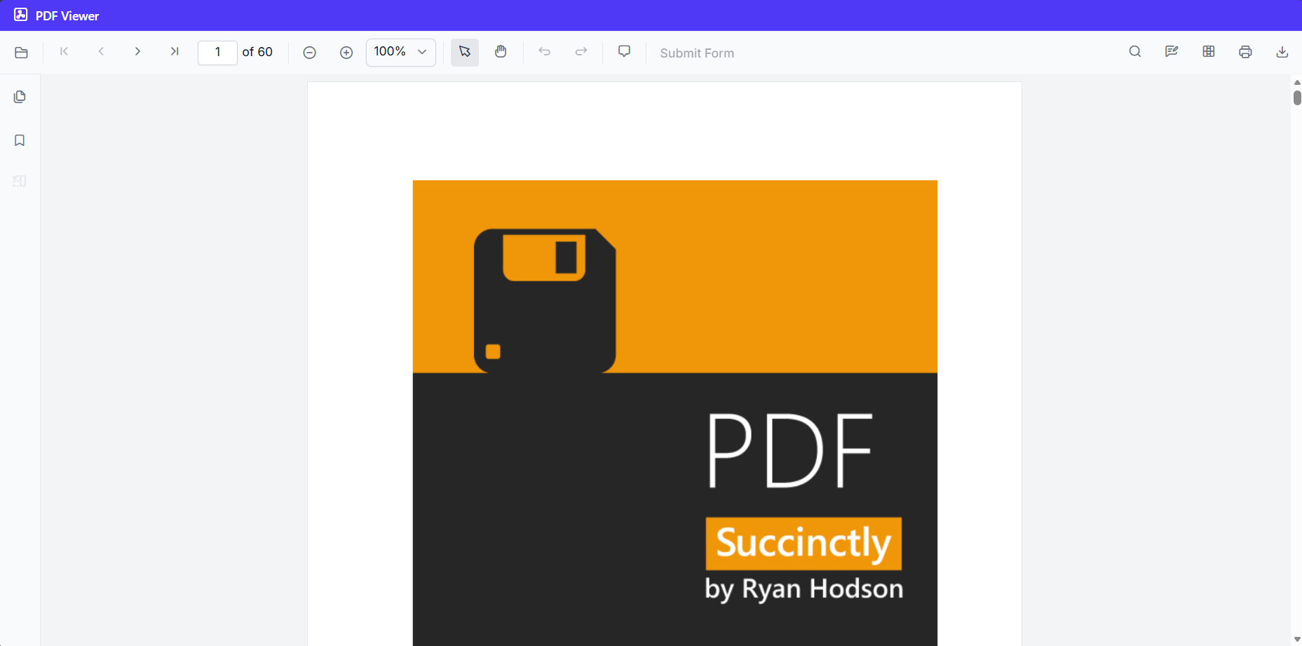
This tool provides options for configuring themes, setting up styling, and integrating icons for Syncfusion React components. It supports multiple themes such as Tailwind 3 CSS, Bootstrap 5.3, Material 3, and Fluent 2, along with light and dark color modes and consistent icon usage.
When to use: When applying themes, customizing colors, modifying component appearance, or adding icons to the UI.
Example:
#sf_react_style Change the theme to tailwind 3 for the PDF Viewer setup
Tips & Best Practices
- Enable Agent mode in your IDE for smooth, multi-step execution with confirmation prompts.
- Use higher-capability models (Claude Sonnet 4.5 or newer, GPT-5) as they typically produce more accurate and higher-quality code.
- If a step times out or becomes unresponsive, cancel it and retry the current step.
- Always review the generated code and commands before accepting or applying them in production.
See also
- To explore customization options for layouts, components, styles, and more examples of effective prompts, refer to the prompt Library.