Patterns and Practices in WPF Ribbon
18 Feb 202524 minutes to read
Ribbon with MVVM
For better control customization MVVM pattern can be followed. The following steps illustrate a simple MVVM pattern with Ribbon control
-
Create new WPF project
-
Add
Modelclass for each element which need to be included in Ribbon control. In this sample class has been created for RibbonTab, RibbonBar and RibbonItem
Model
public class CustomRibbonTab
   {
       public string TabHeader { get; set; }
       public ObservableCollection<CustomRibbonBar> CustomRibbonBars { get; set; }
       public CustomRibbonTab()
       {
           CustomRibbonBars = new ObservableCollection<CustomRibbonBar>();
       }
   }
   public class CustomRibbonBar
   {
       public string BarHeader { get; set; }
       public ObservableCollection<CustomRibbonItem> CustomRibbonItems { get; set; }
       public CustomRibbonBar()
       {
           CustomRibbonItems = new ObservableCollection<CustomRibbonItem>();
       }
   }
   public class CustomRibbonItem
   {
       public CustomRibbonItem()
       {
           IsSplitButton = false;
           IsBoolean = true;
       }
       public string ItemHeader
       {
           get;
           set;
       }
       public string Image { get; set; }
       public bool IsBoolean { get; set; }
       public bool IsLarge { get; set; }
       public bool IsSplitButton { get; set; }
   }
Public Class CustomRibbonTab
Public Property TabHeader() As String
Public Property CustomRibbonBars() As ObservableCollection(Of CustomRibbonBar)
Public Sub New()
CustomRibbonBars = New ObservableCollection(Of CustomRibbonBar)()
End Sub
End Class
Public Class CustomRibbonBar
Public Property BarHeader() As String
Public Property CustomRibbonItems() As ObservableCollection(Of CustomRibbonItem)
Public Sub New()
CustomRibbonItems = New ObservableCollection(Of CustomRibbonItem)()
End Sub
End Class
Public Class CustomRibbonItem
Public Sub New()
IsSplitButton = False
IsBoolean = True
End Sub
Public Property ItemHeader() As String
Public Property Image() As String
Public Property IsBoolean() As Boolean
Public Property IsLarge() As Boolean
Public Property IsSplitButton() As Boolean
End Class- Create
ViewModelclass where the collection has been declared and the items has been populated to it.
ViewModel
public class ViewModel
   {
       public ObservableCollection<CustomRibbonTab> CustomRibbonTabs { get; set; }
       public ViewModel()
       {
           CustomRibbonTabs = new ObservableCollection<CustomRibbonTab>();
           PopulateRibbonTabs();
       }
       void PopulateRibbonTabs()
       {
           CustomRibbonTab Tab1 = new CustomRibbonTab() { TabHeader = "Home" };
           PopulateRibbonHomeBars(Tab1);
           CustomRibbonTabs.Add(Tab1);
       }
   //Home Tab
       void PopulateRibbonHomeBars(CustomRibbonTab Tab)
       {
           CustomRibbonBar Bar1 = new CustomRibbonBar() { BarHeader = "Clipboard" };
           PopulateRibbonNewItems(Bar1);
           CustomRibbonBar Bar2 = new CustomRibbonBar() { BarHeader = "Editing" };
           PopuplateRibbonEditingItems(Bar2);
           Tab.CustomRibbonBars.Add(Bar1);
           Tab.CustomRibbonBars.Add(Bar2);
       }
       void PopulateRibbonNewItems(CustomRibbonBar Bar)
       {
           CustomRibbonItem Item1 = new CustomRibbonItem() { ItemHeader = "Paste", IsLarge = true, Image = "Paste32.png" };
           CustomRibbonItem Item2 = new CustomRibbonItem() { ItemHeader = "Cut", Image = "Cut16.png" };
           CustomRibbonItem Item3 = new CustomRibbonItem() { ItemHeader = "Copy", Image = "Copy16.png" };
           CustomRibbonItem Item4 = new CustomRibbonItem() { ItemHeader = "Format Painter", Image = "FormatPainter16.png" };

           Bar.CustomRibbonItems.Add(Item1);
           Bar.CustomRibbonItems.Add(Item2);
           Bar.CustomRibbonItems.Add(Item3);
           Bar.CustomRibbonItems.Add(Item4);
       }
       private void PopulateRibbonEditingItems(CustomRibbonBar Bar)
       {
           CustomRibbonItem Item1 = new CustomRibbonItem() { ItemHeader = "Hyperlink", IsLarge = true, Image = "hyperlink32.png" };
           CustomRibbonItem Item2 = new CustomRibbonItem() { ItemHeader = "Replace", IsLarge = true, Image = "replace_32.png" };
           CustomRibbonItem Item3 = new CustomRibbonItem() { ItemHeader = "Zoom", IsLarge = true, Image = "Zoom_32x32.png" };

           Bar.CustomRibbonItems.Add(Item1);
           Bar.CustomRibbonItems.Add(Item2);
           Bar.CustomRibbonItems.Add(Item3);
       }
   }
Public Class ViewModel
Public Property CustomRibbonTabs() As ObservableCollection(Of CustomRibbonTab)
Public Sub New()
CustomRibbonTabs = New ObservableCollection(Of CustomRibbonTab)()
PopulateRibbonTabs()
End Sub
Private Sub PopulateRibbonTabs()
Dim Tab1 As New CustomRibbonTab() With {.TabHeader = "Home"}
PopulateRibbonHomeBars(Tab1)
CustomRibbonTabs.Add(Tab1)
End Sub
'Home Tab
Private Sub PopulateRibbonHomeBars(ByVal Tab As CustomRibbonTab)
Dim Bar1 As New CustomRibbonBar() With {.BarHeader = "Clipboard"}
PopulateRibbonNewItems(Bar1)
Dim Bar2 As New CustomRibbonBar() With {.BarHeader = "Editing"}
PopulateRibbonEditingItems(Bar2)
Tab.CustomRibbonBars.Add(Bar1)
Tab.CustomRibbonBars.Add(Bar2)
End Sub
Private Sub PopulateRibbonNewItems(ByVal Bar As CustomRibbonBar)
Dim Item1 As New CustomRibbonItem() With {
.ItemHeader = "Paste",
.IsLarge = True,
.Image = "Paste32.png"
}
Dim Item2 As New CustomRibbonItem() With {
.ItemHeader = "Cut",
.Image = "Cut16.png"
}
Dim Item3 As New CustomRibbonItem() With {
.ItemHeader = "Copy",
.Image = "Copy16.png"
}
Dim Item4 As New CustomRibbonItem() With {
.ItemHeader = "Format Painter",
.Image = "FormatPainter16.png"
}
Bar.CustomRibbonItems.Add(Item1)
Bar.CustomRibbonItems.Add(Item2)
Bar.CustomRibbonItems.Add(Item3)
Bar.CustomRibbonItems.Add(Item4)
End Sub
Private Sub PopulateRibbonEditingItems(ByVal Bar As CustomRibbonBar)
Dim Item1 As New CustomRibbonItem() With {
.ItemHeader = "Hyperlink",
.IsLarge = True,
.Image = "hyperlink32.png"
}
Dim Item2 As New CustomRibbonItem() With {
.ItemHeader = "Replace",
.IsLarge = True,
.Image = "replace_32.png"
}
Dim Item3 As New CustomRibbonItem() With {
.ItemHeader = "Zoom",
.IsLarge = True,
.Image = "Zoom_32x32.png"
}
Bar.CustomRibbonItems.Add(Item1)
Bar.CustomRibbonItems.Add(Item2)
Bar.CustomRibbonItems.Add(Item3)
End Sub
End Class- In XAML bind the collection to Ribbon control and use ItemContainerStyle to bind the inner level items like RibbonBar and RibbonItems
MainWindow.xaml
<syncfusion:RibbonWindow x:Class="RibbonSample_in_MVVM.MainWindow"
   xmlns="http://schemas.microsoft.com/winfx/2006/xaml/presentation"
   xmlns:x="http://schemas.microsoft.com/winfx/2006/xaml" syncfusion:SkinStorage.VisualStyle="Office2013"
   xmlns:syncfusion="http://schemas.syncfusion.com/wpf"
   xmlns:local="clr-namespace:RibbonSample_in_MVVM"
   Title="MainWindow" Height="350" Width="525">
   <Window.Resources>
   <ResourceDictionary>
   <ResourceDictionary.MergedDictionaries>
   <ResourceDictionary Source="/Syncfusion.Tools.WPF;component/Framework/Ribbon/Themes/Office2013Style.xaml" />
   </ResourceDictionary.MergedDictionaries>
   <local:BooltoSizeformConverter x:Key="sizeform"/>
   <local:ItemDataTemplateSelector x:Key="selector"/>
   <local:ImageConverter x:Key="image"/>
   <DataTemplate x:Key="Ribbonbutton">
   <syncfusion:RibbonButton Label="{Binding ItemHeader}" SizeForm="{Binding IsLarge, Converter={StaticResource sizeform}}"  LargeIcon="{Binding Image,Converter={StaticResource image}}" SmallIcon="{Binding Image,Converter={StaticResource image}}"/>
   </DataTemplate>
   <DataTemplate x:Key="Splitbutton">
   <syncfusion:SplitButton Label="{Binding ItemHeader}" SizeForm="{Binding IsLarge, Converter={StaticResource sizeform}}"  LargeIcon="{Binding Image,Converter={StaticResource image}}" SmallIcon="{Binding Image,Converter={StaticResource image}}"/>
   </DataTemplate>
   </ResourceDictionary>
   </Window.Resources>
   <Window.DataContext>
   <local:ViewModel/>
   </Window.DataContext>
   <Grid>
   <syncfusion:Ribbon
   x:Name="_ribbon"  VerticalAlignment="Top"
   ItemsSource="{Binding CustomRibbonTabs}"
   <syncfusion:Ribbon.ItemContainerStyle>
   <Style TargetType="{x:Type syncfusion:RibbonTab}">
   <Setter Property="Caption" Value="{Binding TabHeader}"></Setter>
   <Setter Property="ItemsSource" Value="{Binding CustomRibbonBars}"/>
   <Setter Property="ItemContainerStyle">
   <Setter.Value>
   <Style BasedOn="{StaticResource Office2013RibbonBarStyle}" TargetType="{x:Type syncfusion:RibbonBar}">
   <Setter Property="Header" Value="{Binding BarHeader}"/>
   <Setter Property="ItemsSource" Value="{Binding CustomRibbonItems}"/>
   <Setter Property="ItemTemplateSelector" Value="{StaticResource selector}"/>
   </Style>
   </Setter.Value>
   </Setter>
   </Style>
   </syncfusion:Ribbon.ItemContainerStyle>
   </syncfusion:Ribbon>
   </Grid>
</syncfusion:RibbonWindow>- Converter class is used to set
SizeFormfor the Ribbon items and to set images.
Converter.cs
public class BooltoSizeformConverter : IValueConverter
   {
       public object Convert(object value, Type targetType, object parameter, System.Globalization.CultureInfo culture)
       {
           if (value.Equals(true))
           {
               return "Large";
           }
           else
           {
               return "Small";
           }
       }
       public object ConvertBack(object value, Type targetType, object parameter, System.Globalization.CultureInfo culture)
       {
           throw new NotImplementedException();
       }
   }
   public class ItemDataTemplateSelector : DataTemplateSelector
   {
       public override DataTemplate SelectTemplate(object item, DependencyObject container)
       {
           FrameworkElement element = container as FrameworkElement;
           if (element != null && item != null)
           {
               if (item is CustomRibbonItem && (item as CustomRibbonItem).IsSplitButton)
               {
                   return element.FindResource("Splitbutton") as DataTemplate;
               }
               else
               {
                   return element.FindResource("Ribbonbutton") as DataTemplate;
               }
           }
           return null;
       }
   }
   public class ImageConverter : IValueConverter
   {
       public object Convert(object value, Type targetType, object parameter, System.Globalization.CultureInfo culture)
       {
           if (value != null)
           {
               string str = value.ToString();
               return "../Images/" + str;
           }
           else
           {
               return value;
           }
       }
       public object ConvertBack(object value, Type targetType, object parameter, System.Globalization.CultureInfo culture)
       {
           throw new System.NotImplementedException();
       }
   }
Public Class BooltoSizeformConverter
Implements IValueConverter
Public Function Convert(ByVal value As Object, ByVal targetType As Type, ByVal parameter As Object, ByVal culture As System.Globalization.CultureInfo) As Object
If value.Equals(True) Then
Return "Large"
Else
Return "Small"
End If
End Function
Public Function ConvertBack(ByVal value As Object, ByVal targetType As Type, ByVal parameter As Object, ByVal culture As System.Globalization.CultureInfo) As Object
Throw New NotImplementedException()
End Function
End Class
Public Class ItemDataTemplateSelector
Inherits DataTemplateSelector
Public Overrides Function SelectTemplate(ByVal item As Object, ByVal container As DependencyObject) As DataTemplate
Dim element As FrameworkElement = TryCast(container, FrameworkElement)
If element IsNot Nothing AndAlso item IsNot Nothing Then
If TypeOf item Is CustomRibbonItem AndAlso (TryCast(item, CustomRibbonItem)).IsSplitButton Then
Return TryCast(element.FindResource("Splitbutton"), DataTemplate)
Else
Return TryCast(element.FindResource("Ribbonbutton"), DataTemplate)
End If
End If
Return Nothing
End Function
End Class
Public Class ImageConverter
Implements IValueConverter
Public Function Convert(ByVal value As Object, ByVal targetType As Type, ByVal parameter As Object, ByVal culture As System.Globalization.CultureInfo) As Object
If value IsNot Nothing Then
Dim str As String = value.ToString()
Return "../Images/" & str
Else
Return value
End If
End Function
Public Function ConvertBack(ByVal value As Object, ByVal targetType As Type, ByVal parameter As Object, ByVal culture As System.Globalization.CultureInfo) As Object
Throw New System.NotImplementedException()
End Function
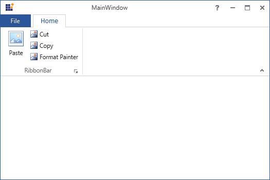
End ClassNow the output displays the Ribbon control with the populated items
Practice with PRISM
Ribbon control provides PRISM support. The following steps explain about creating simple sample project in the PRISM.
-
Create new WPF project and add the following references to the solution project.
- Microsoft.Practices.ServiceLocation.dll
- Microsoft.Practices.Unity.dll
- Microsoft.Practices.Unity.Configuration.dll
- Microsoft.Practices.Unity.RegistrationByConvention.dll
- Prism.dll
- Prism.Unity.Wpf.dll
- Prism.Wpf.dll
-
Rename MainWindow to Shell in the Project
-
Add new class called Bootstrapper.cs to initialize the prism application.
class Bootstrapper : UnityBootstrapper
{
    protected override DependencyObject CreateShell()
    {
        return Container.Resolve<Shell>();
    }
    protected override void InitializeShell()
    {
        base.InitializeShell();
        App.Current.MainWindow = (Shell)this.Shell;
        App.Current.MainWindow.Show();
    }
    protected override void ConfigureModuleCatalog()
    {
        base.ConfigureModuleCatalog();
        ModuleCatalog catalog = (ModuleCatalog)this.ModuleCatalog;
        catalog.AddModule(typeof(HomeTabModule.HomeTabModules));
    }
}
Friend Class Bootstrapper Inherits UnityBootstrapper Protected Overrides Function CreateShell() As DependencyObject Return Container.Resolve(Of Shell)() End Function Protected Overrides Sub InitializeShell() MyBase.InitializeShell() App.Current.MainWindow = CType(Me.Shell, Shell) App.Current.MainWindow.Show() End Sub Protected Overrides Sub ConfigureModuleCatalog() MyBase.ConfigureModuleCatalog() Dim catalog As ModuleCatalog = CType(Me.ModuleCatalog, ModuleCatalog) catalog.AddModule(GetType(HomeTabModule.HomeTabModules)) End Sub End Class -
Override OnStartup method in the App.xaml.cs to execute Bootstrapper when the application starts
public partial class App : Application
{
    protected override void OnStartup(StartupEventArgs e)
    {
        base.OnStartup(e);
        Bootstrapper bootstrapper = new Bootstrapper();
        bootstrapper.Run();
    }
}
Partial Public Class App Inherits Application Protected Overrides Sub OnStartup(ByVal e As StartupEventArgs) MyBase.OnStartup(e) Dim bootstrapper As New Bootstrapper() bootstrapper.Run() End Sub End Class -
Next step is to create regions in the shell. To do this, first add the following namespace in the shell Window
xmlns:Cal="http://www.codeplex.com/CompositeWPF"
In the below code, a region called “Tabs” has been created to load RibbonTab Module views
<div class="tabs">
<ul class="nav nav-tabs" role="tablist">
<li role="presentation" class=""><a data-target="#0joq8qyrvvqsm8ehlg5b5p650dhguumr-xml" aria-controls="home" role="tab" data-toggle="tab" data-original-lang="xaml">XAML</a></li>
</ul>
<div class="tab-content">
<div role="tabpanel" class="tab-pane" id="0joq8qyrvvqsm8ehlg5b5p650dhguumr-xml" data-original-lang = "xaml" ><div class="highlight"><pre><code class="language-xml" data-lang="xml"><span></span><span class="nt"><syncfusion:RibbonWindow</span> <span class="na">x:Class=</span><span class="s">"RibbonDemoSample.Shell"</span>
<span class="na">xmlns=</span><span class="s">"http://schemas.microsoft.com/winfx/2006/xaml/presentation"</span>
<span class="na">xmlns:x=</span><span class="s">"http://schemas.microsoft.com/winfx/2006/xaml"</span>
<span class="na">xmlns:Cal=</span><span class="s">"http://www.codeplex.com/CompositeWPF"</span> <span class="na">syncfusion:SkinStorage.VisualStyle=</span><span class="s">"Office2013"</span>
<span class="na">xmlns:syncfusion=</span><span class="s">"http://schemas.syncfusion.com/wpf"</span>
<span class="na">Title=</span><span class="s">"MainWindow"</span> <span class="na">Height=</span><span class="s">"350"</span> <span class="na">Width=</span><span class="s">"525"</span><span class="nt">></span>
<span class="nt"><Grid></span>
<span class="nt"><syncfusion:Ribbon</span> <span class="na">Cal:RegionManager.RegionName=</span><span class="s">"Tabs"</span> <span class="na">VerticalAlignment=</span><span class="s">"Top"</span><span class="nt">></span>
<span class="nt"></syncfusion:Ribbon></span>
<span class="nt"></Grid></span>
<span class="nt"></syncfusion:RibbonWindow></span></code></pre></div>
</div>
</div>
</div>
- Adding Module to the project
Right click the Solution project, point to “Add” and then click “NewProject”. The new Window called AddNewProject gets open. Select “ClassLibrary” from Visual C# then rename the project with desired name and click “Ok”. Now a new Module has been created in the Solution Project
Now add following assemblies to the Module project
- PresentationCore.dll
- PresentationFramework.dll
- WindowsBase.dll
Also add following Prism assemblies
- Microsoft.Practices.ServiceLocation.dll
- Microsoft.Practices.Unity.dll
- Microsoft.Practices.Unity.Configuration.dll
- Microsoft.Practices.Unity
- RegistrationByConvention.dll
- Prism.dll
- Prism.Unity.Wpf.dll
- Prism.WPF.dll
-
In the Shell project, add the reference to the “HomeTabModule” project by registering with ModuleCatalog instance in the GetModuleCatalog method
class Bootstrapper : UnityBootstrapper
{
    protected override DependencyObject CreateShell()
    {
        return Container.Resolve<Shell>();
    }
    protected override void InitializeShell()
    {
        base.InitializeShell();
        App.Current.MainWindow = (Shell)this.Shell;
        App.Current.MainWindow.Show();
    }
    protected override void ConfigureModuleCatalog()
    {
        base.ConfigureModuleCatalog();
        ModuleCatalog catalog = (ModuleCatalog)this.ModuleCatalog;
        catalog.AddModule(typeof(HomeTabModule.HomeTabModules));
    }
}
Friend Class Bootstrapper Inherits UnityBootstrapper Protected Overrides Function CreateShell() As DependencyObject Return Container.Resolve(Of Shell)() End Function Protected Overrides Sub InitializeShell() MyBase.InitializeShell() App.Current.MainWindow = CType(Me.Shell, Shell) App.Current.MainWindow.Show() End Sub Protected Overrides Sub ConfigureModuleCatalog() MyBase.ConfigureModuleCatalog() Dim catalog As ModuleCatalog = CType(Me.ModuleCatalog, ModuleCatalog) catalog.AddModule(GetType(HomeTabModule.HomeTabModules)) End Sub End Class -
Adding Views to the Module
<syncfusion:RibbonTab x:Class="HomeTabModule.HomeTab" xmlns="http://schemas.microsoft.com/winfx/2006/xaml/presentation" xmlns:x="http://schemas.microsoft.com/winfx/2006/xaml" xmlns:mc="http://schemas.openxmlformats.org/markup-compatibility/2006" xmlns:d="http://schemas.microsoft.com/expression/blend/2008" xmlns:syncfusion="http://schemas.syncfusion.com/wpf" mc:Ignorable="d" d:DesignHeight="300" d:DesignWidth="300" Caption="Home" IsChecked="True" > <syncfusion:RibbonBar> <syncfusion:RibbonBar.Resources> <ResourceDictionary Source="/Syncfusion.Tools.WPF;component/Framework/Ribbon/Themes/Office2013Style.xaml" /> </syncfusion:RibbonBar.Resources> <syncfusion:RibbonBar.Style> <Style BasedOn="{StaticResource Office2013RibbonBarStyle}" TargetType="{x:Type syncfusion:RibbonBar}"> </Style> </syncfusion:RibbonBar.Style> <syncfusion:RibbonButton Width="44" Margin="3,0,3,3" Label="Paste" SizeForm="Large" syncfusion:Ribbon.KeyTip="CP" syncfusion:RibbonCommandManager.SynchronizedItem="Paste"> <syncfusion:RibbonButton.ToolTip> <syncfusion:ScreenTip Description="Paste (Ctrl+V)"> <TextBlock Width="130" HorizontalAlignment="Left" Foreground="#FF4C4C4C" Text="Paste the contents of clipboard." TextWrapping="Wrap" /> </syncfusion:ScreenTip> </syncfusion:RibbonButton.ToolTip> </syncfusion:RibbonButton> <syncfusion:RibbonButton HorizontalAlignment="Left" Label="Cut" SizeForm="Small" syncfusion:Ribbon.KeyTip="CT"> <syncfusion:RibbonButton.ToolTip> <syncfusion:ScreenTip Description="Cut (Ctrl+X)"> <TextBlock Width="130" HorizontalAlignment="Left" Text="Cut the selection and put it on the clipboard." TextWrapping="Wrap" /> </syncfusion:ScreenTip> </syncfusion:RibbonButton.ToolTip> </syncfusion:RibbonButton> <syncfusion:RibbonButton HorizontalAlignment="Left" Label="Copy" SizeForm="Small" syncfusion:Ribbon.KeyTip="CY"> <syncfusion:RibbonButton.ToolTip> <syncfusion:ScreenTip Description="Copy (Ctrl+C)"> <TextBlock Width="130" HorizontalAlignment="Left" Foreground="#FF4C4C4C" Text="Copy the selection and put it on the clipboard." TextWrapping="Wrap" /> </syncfusion:ScreenTip> </syncfusion:RibbonButton.ToolTip> </syncfusion:RibbonButton> <syncfusion:RibbonButton Label="Format Painter" SizeForm="Small" syncfusion:Ribbon.KeyTip="CR"> <syncfusion:RibbonButton.ToolTip> <syncfusion:ScreenTip Description="Format painter (Ctrl+Shift+C)" HelpText="Press F1 for more help."> <TextBlock Width="175" HorizontalAlignment="Left" Foreground="#FF4C4C4C" TextWrapping="Wrap"> <Run Text="Copy formatting from one place and apply it to another." /> <LineBreak /> <LineBreak /> <Run Text="Double-click this button to apply the same formatting to multiple places in the document." /> </TextBlock> </syncfusion:ScreenTip> </syncfusion:RibbonButton.ToolTip> </syncfusion:RibbonButton> </syncfusion:RibbonBar> </syncfusion:RibbonTab> -
Add a region to the shell and after creating View for the Module, register the view as Module using the below code
public class HomeTabModules : IModule
{
    private readonly IRegionManager regionManager;
    public HomeTabModules(IRegionManager regionManager)
    {
        this.regionManager = regionManager;
    }
    public void Initialize()
    {
        regionManager.Regions["Tabs"].Add(new HomeTab());
    }
}
Public Class HomeTabModules Implements IModule Private ReadOnly regionManager As IRegionManager Public Sub New(ByVal regionManager As IRegionManager) Me.regionManager = regionManager End Sub Public Sub Initialize() regionManager.Regions("Tabs").Add(New HomeTab()) End Sub End Class
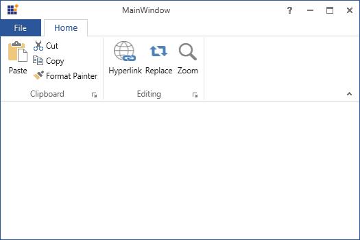
Now run the project. RibbonTabModule get added as one of the Module in the Shell. Similarly any number of Modules can be added based on the complexity of the project.