Getting Started
8 Aug 20175 minutes to read
This section explains briefly about how to create a Splitter in ASP.NET MVC application.
Create your first Splitter in MVC
ASP.NET MVCSplitter control consists of movable split bar(s) that divides the container’s display area into two or more resizable and collapsible panels. Refer the following guidelines to create a Splitter, add tree view in the Splitter and how to set actions to view the image that is used to split the document or image and also Expand or Collapse the Splitter.
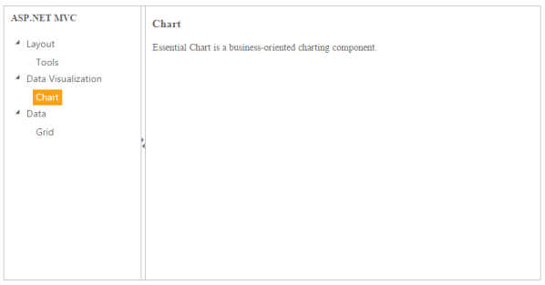
The following screenshot illustrates a Splitter control.
Create a Splitter
Essential Studio ASP.NET MVC Splitter control has a built-in feature to split the display into horizontal and vertical order.
- Create an MVC Project and add required assemblies, scripts, and styles to it. Refer MVC-Getting Started Documentation.
-
Add the following code example to the corresponding view page to render the Splitter. You can download the desired mobile and name it as galaxy.jpg. ‘ContentTemplate’ property is used to specify the HTML tags within the helper elements. Here we have used the contentTemplate property to specify the contents of the splitter control.
@{Html.EJ().Splitter("outerSplitter").PaneProperties(p => { p.Add().ContentTemplate( @<div class="cont"> <h3 class="h3"> ASP.NET MVC </h3> @*Add Tree Element here*@ </div>).PaneSize("200"); p.Add().ContentTemplate( @<div class="cont"> <div class="_content"> Select any product from the tree to show the description. </div> <div class="tools des"> <h3> Tools </h3> <p> Essential Tools is an collection of user interface components used to create interactive ASP.NET MVC applications. </p> </div> <div class="chart des"> <h3> Chart </h3> <p> Essential Chart is a business-oriented charting component.</p> </div> <div class="grid des"> <h3> Grid </h3> <p> Essential MVC Grid offers full featured a Grid control with extensive support for Grouping and the display of hierarchical data. </p> </div> </div>).PaneSize("200"); }).Height("400").Width("100%").Render();} -
Add the following style in the view page to set the height and width of the Splitter.
 <style type="text/css" class="cssStyles">

     #outerSplitter
     {

     margin: 0 auto;

     }

     .cont #treeView_Container
     {

     margin-bottom: 0;

     border: none;

     }

     .h3, ._content, p
     {

     font-size: 14px;

     margin-top: 10px;

     text-indent: 10px;

     }

     .des
     {

     display: none;

     }

 </style>
##Configure Tree View
Add the following code example in the corresponding view page. ‘HtmlAttributes’ property is used to add HTML attributes like, id, class etc.. to the components. We need to use IDictionary<string, object> to specify the HTML attributes. Please check the below code.
@{IDictionary<string, object> htmlAttribute = new Dictionary<string, object>();

htmlAttribute.Add("class", "_child");

}


@Html.EJ().TreeView("treeview").Items(items =>

{

items.Add().Text("Layout").Expanded(true).Children(child =>

{

	child.Add().Id("tools").Text("Tools").HtmlAttributes(htmlAttribute);

});

items.Add().Text("Data Visualization").Expanded(true).Children(child =>

{

   child.Add().Id("chart").Text("Chart").HtmlAttributes(htmlAttribute);


});

items.Add().Text("Data").Expanded(true).Children(child =>

{

	child.Add().Id("grid").Text("Grid").HtmlAttributes(htmlAttribute);

});


}).ClientSideEvents(e => e.NodeSelect("treeClicked"))
Set Actions to Splitter control to view the image
Add the following code example in the view page to set action in Splitter control to view the image.
<script type="text/javascript">


function treeClicked(sender, args)
{

	if (sender.currentElement.hasClass('_child'))
	{
		//nodeSelect event handle

		var content = $('.' + sender.currentElement[0].id).html();

		$('._content').html(content);

	}

}

</script>
Execute the above code example to render the following output.
